Dear ones, how are the first days of June going for you? I’ve had some pretty busy days, so my June BuJo Post is coming a little late again. I also did something a little irresponsible last week. I wanted to stock up my Tombow brush pen collection with more colors and as I was looking in different shops and online I quickly realized that I should’ve bought them back when I was still in the US. They are so expensive in Germany! So I did some research on Tombow alternatives and I came across a pretty good offer for a 48 set of the Sakura Koi Coloring Brush Pens. I don’t wanna tell you exactly how much I paid for them but it was definitely somewhat unmindful, considering that I am only going to start work again in July and need to pay my rent this month 😀 BUT, for good quality brush pens, especially when compared to Tombow, this was still a very good deal that I couldn’t pass by.
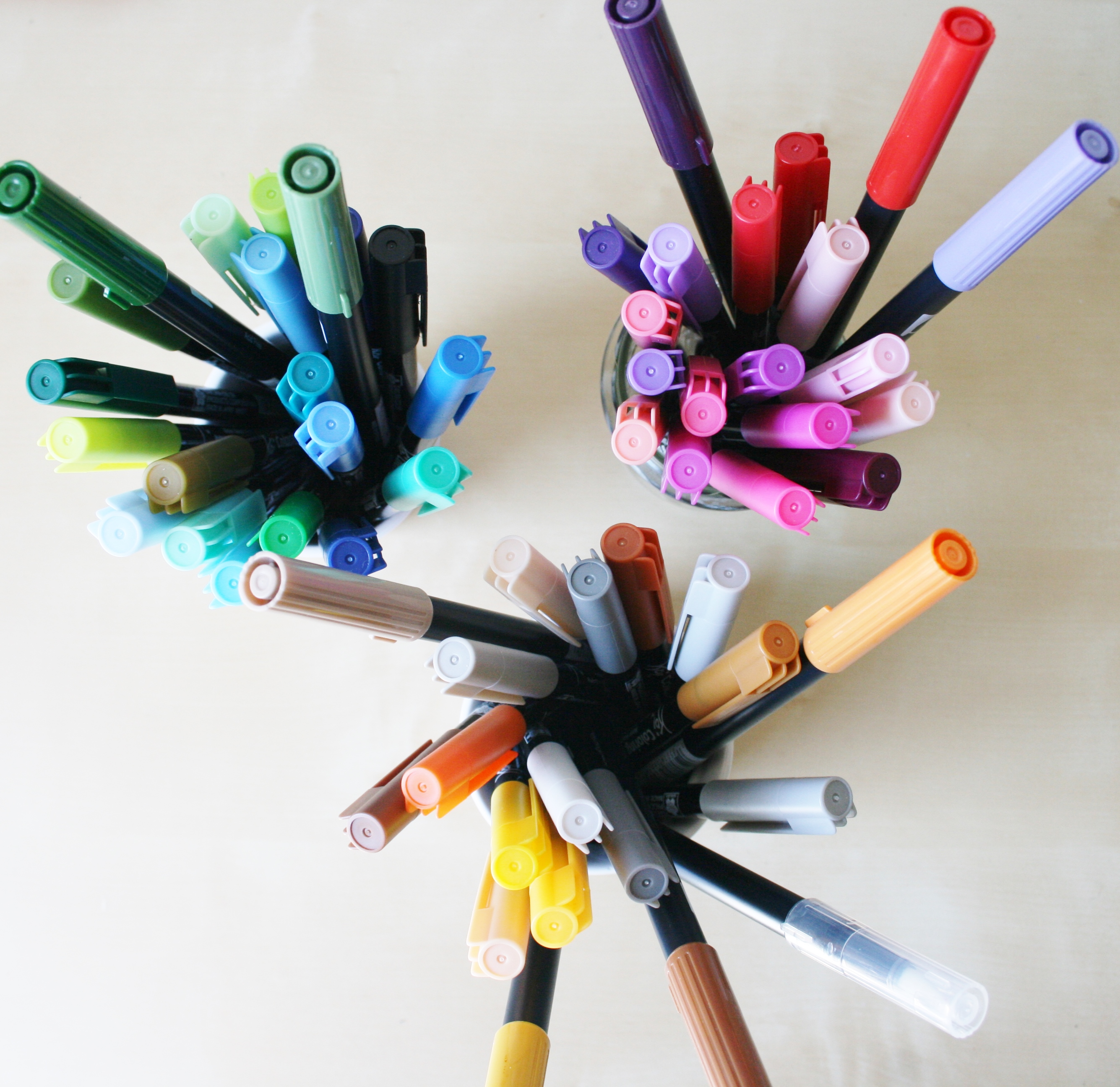
Sooo, I tried my new pens in this month’s bullet journal spreads and I thought I’d share my mini review with you. Here are all the colors that came in the 48 pack (along with my Tombow collection, they’re the longer ones):
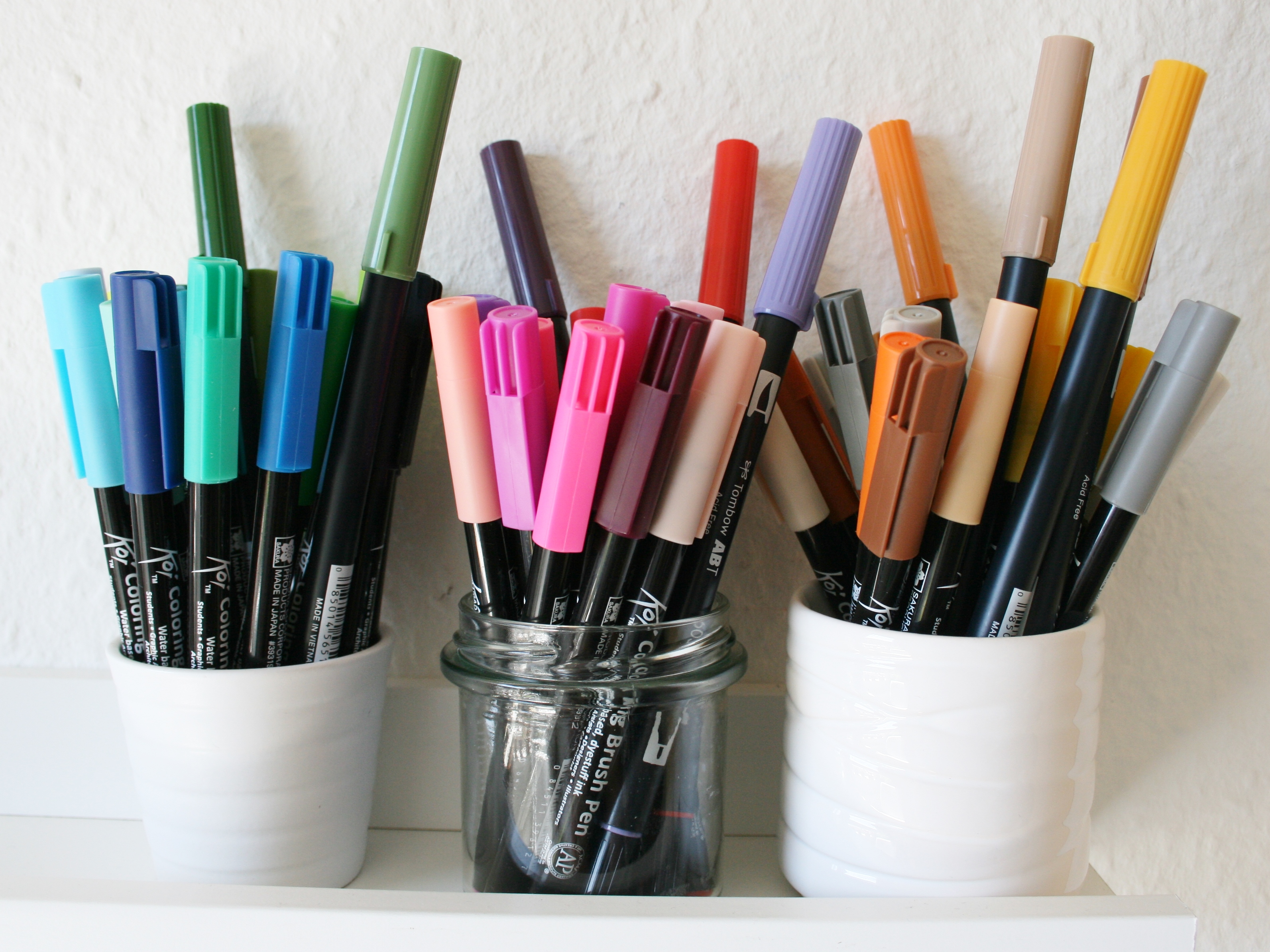
Here are the things I like about the Koi brush pens:
- They are easy to hold and handle and I feel like my lines are a little less shaky than when I write with Tombows (Or maybe it’s just that I’ve gotten a little better over time?). They are a surprisingly great quality and I think they are a great value for the money that I paid for them.
- The pack has a nice range of colors, from super pale ones to vivid, bright shades. My favorite shade so far is ‘Salmon Pink’ (which is more like a deep pink-purplish berry color than a salmon-like shade).
These are the downsides that I noticed:
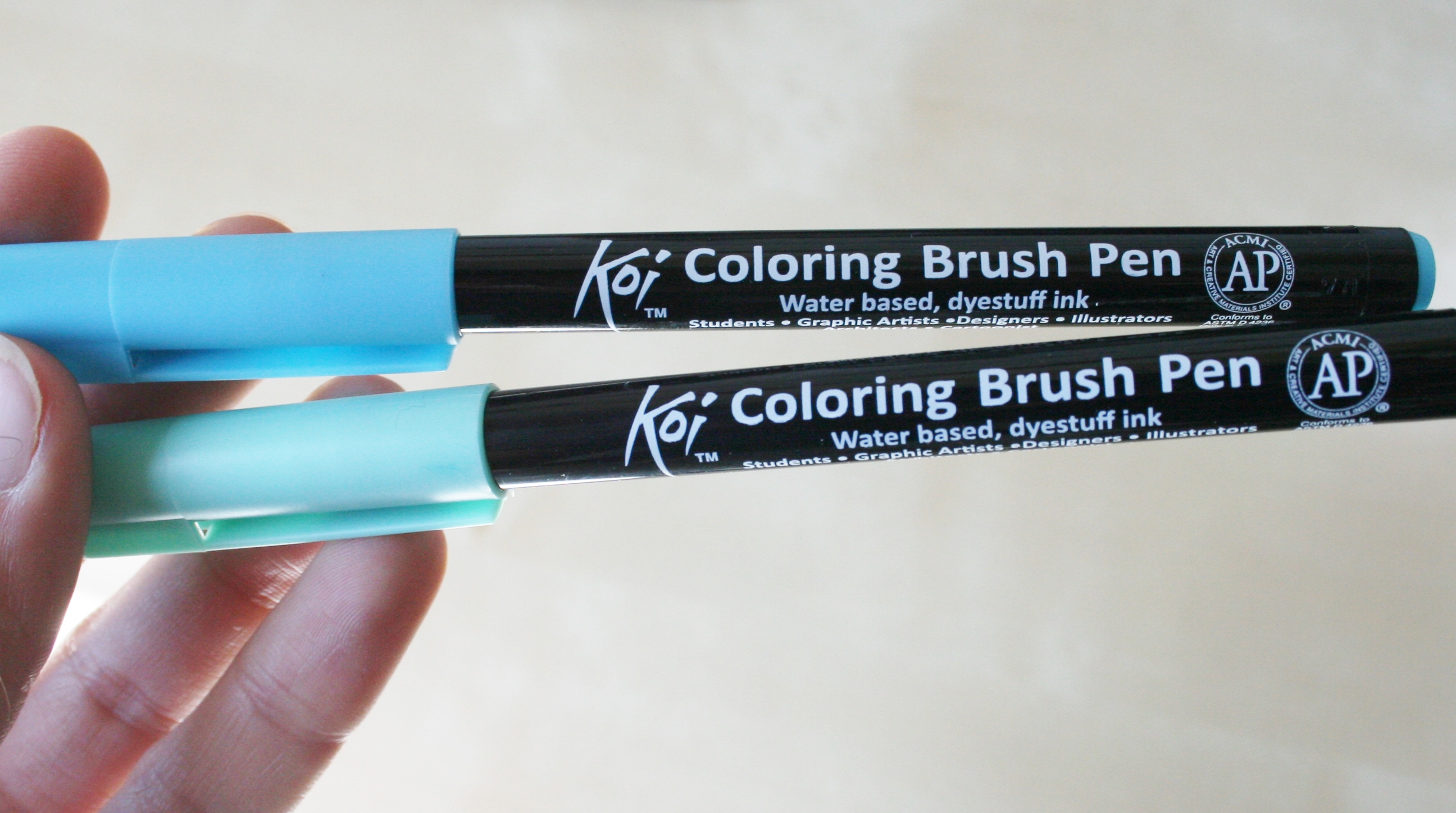
- The colors that the pens paint don’t really match the cap colors. For some colors, the difference between the painted color and the cap color is pretty drastic, actually. This makes choosing colors kinda annoying as I have to swatch every color on a scrap piece of paper before using it for my actual work.
- I would’ve liked to see more pastel colors in the set. If you only look at the cap colors, it looks like there’s a good amount of pastels in there but in reality most of them are way more vivid. I’m especially missing a pastel yellow and a pastel green.
- I feel like the Koi pens ghost more than the Tombow brush pens do (this refers to the shadows of the painted areas you can see on the back of the paper) and I have to be careful not to layer too many colors or strokes over each other because otherwise they will also start to bleed through the page.
Overall, I’m still happy with the purchase even though I have to swatch a lot 🙂 And I could always add a couple colors if I wanted to in the future. Do you use Koi brush pens? What do you think of them? I’m planning to try some different techniques with them soon. I’ve drawn some illustrations a couple weeks ago that I’d like to color in and I’m very excited to try out this technique for painting skin tones!
Let’s get into my bullet journal spreads for this month. I have actually only created two weekly spreads this month because I will go on a vacation on June 14th and probably won’t use my journal during that time. I am so excited because my Mom and I are going to visit my brother and his girlfriend in Taiwan! We will travel the country together and I am so ready to see the mountains and lush tropical forests and beaches and dolphins and lizards! Nature makes me so incredibly happy and I am so grateful that I have the opportunity to travel. <3
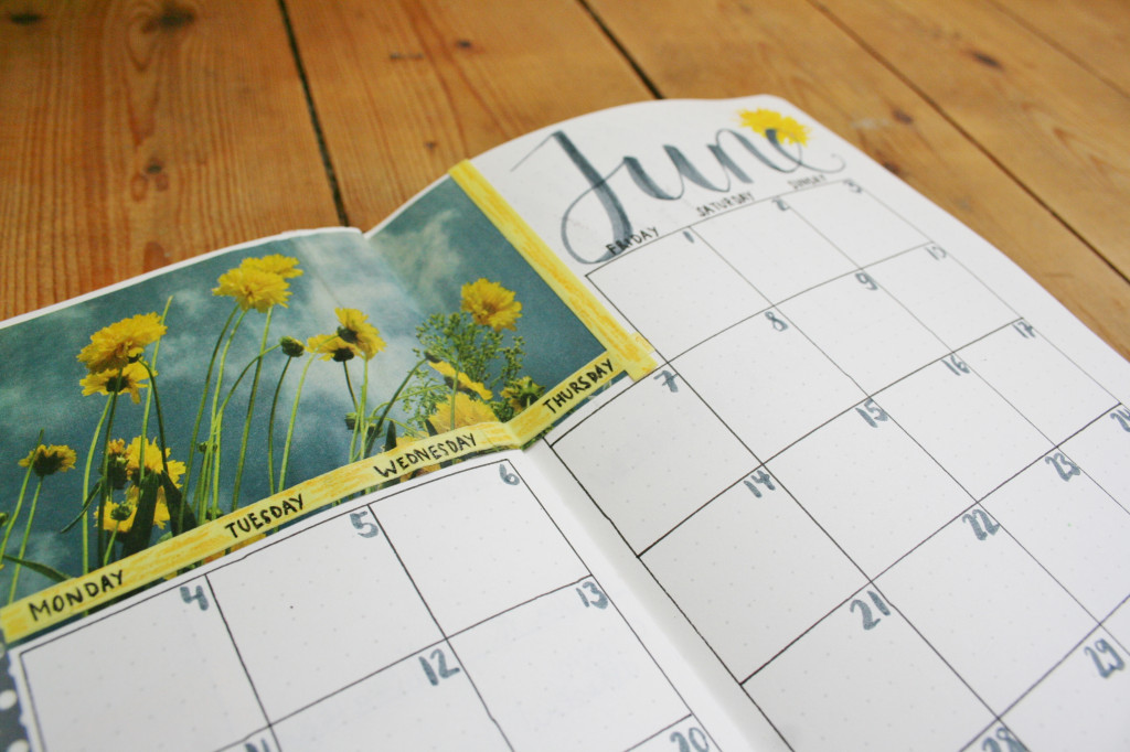
I decided to still put the whole month into my monthly spread just for a better overview:
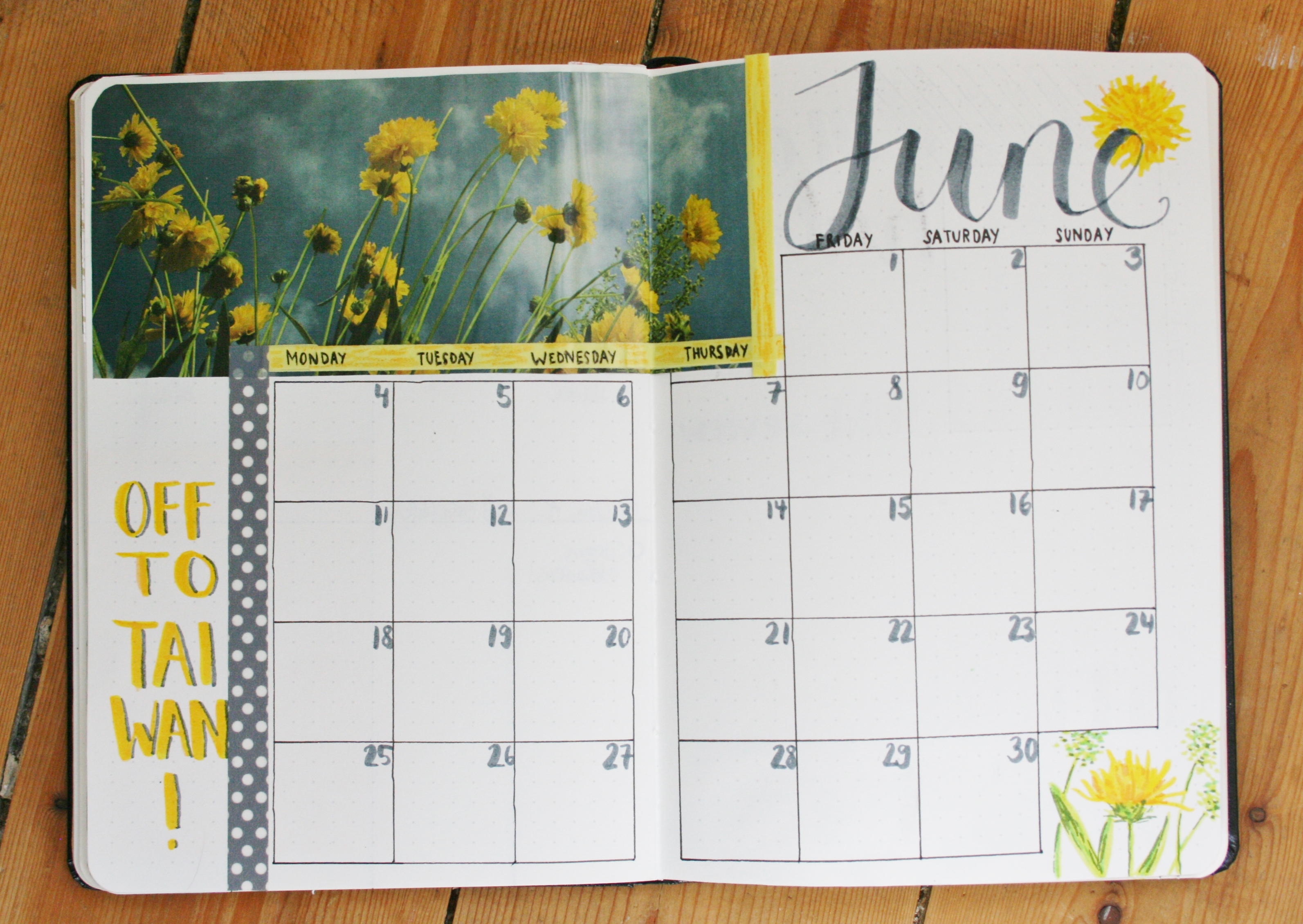
These colors just scream summer to me, I love it! Hamburg has treated me really well temperature-wise since I’ve come back from the US, it has been super summery here!
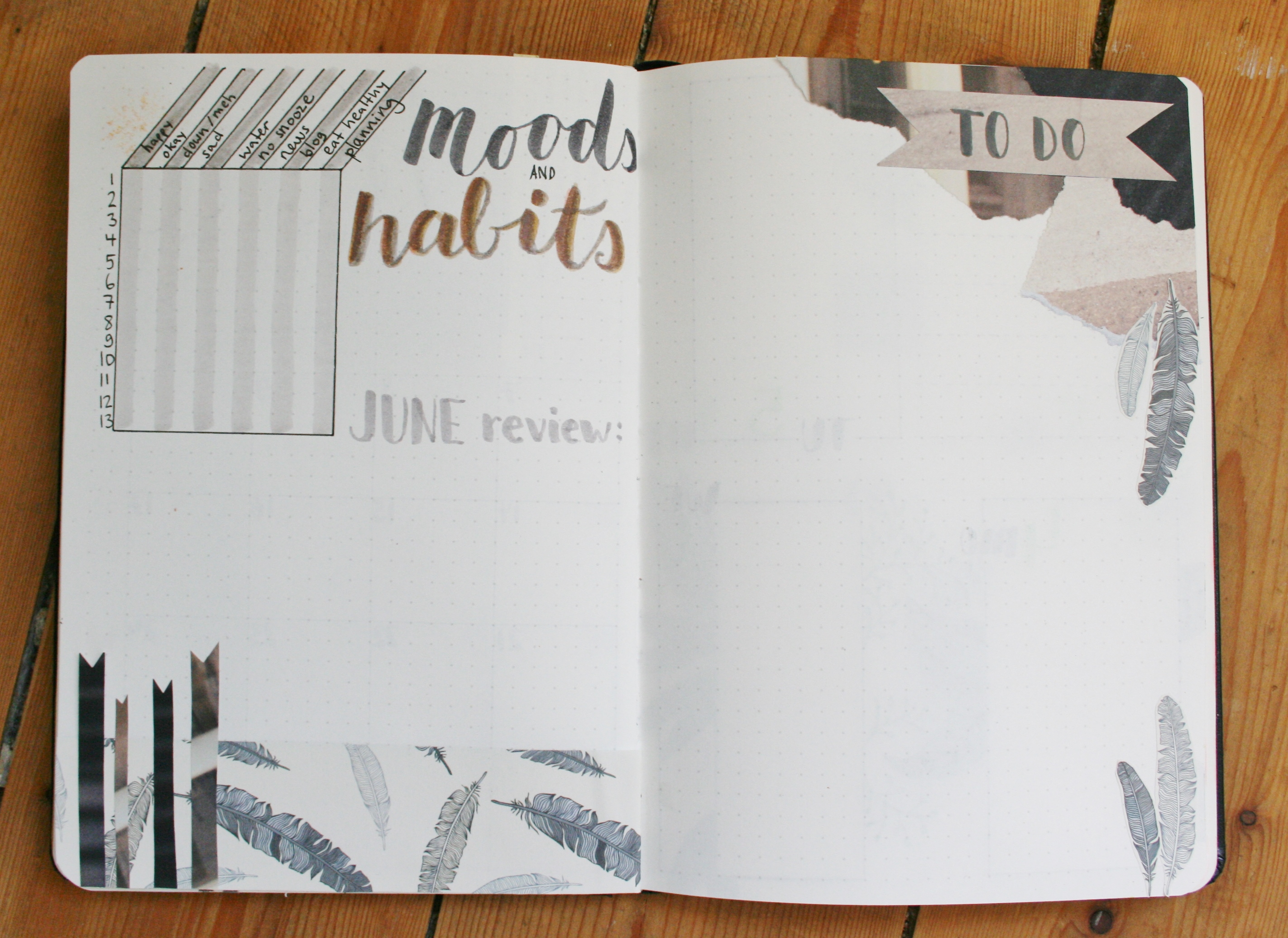
Since I will not need the habit and mood tracker after the 13th, I was able to fit it on one page together with the space for my monthly review. On the other side I have made some space for a new to do list. Since there wasn’t a suitable color in the Koi set to get this beige brown color you can see in the scrap paper, I layered several different colors over one another. Also, I love that I now have a super pale gray tone to use for grids like this one in the tracker! It just makes the page look more interesting and put together, imo.
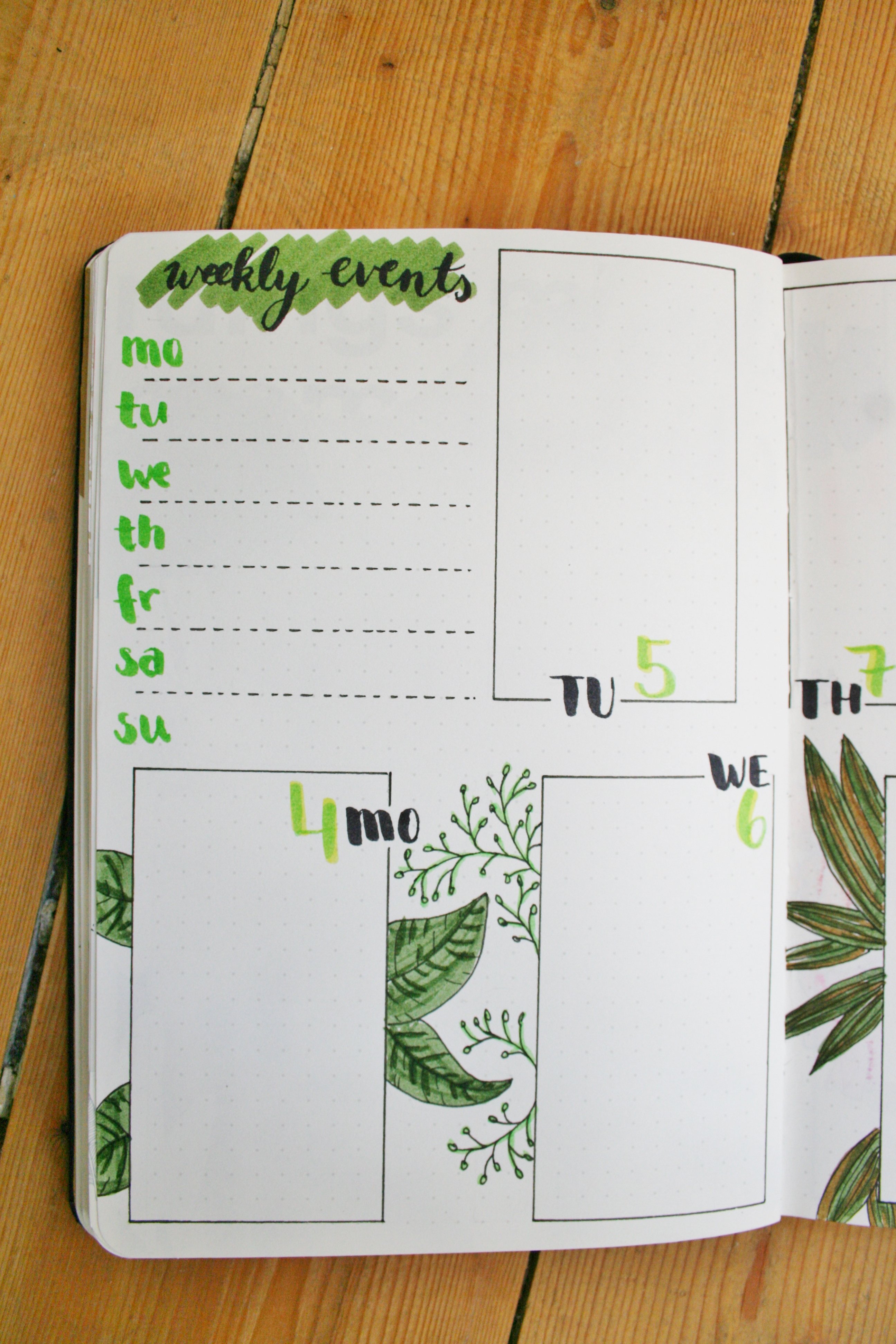
Below is my first weekly spread and I actually mixed the layout up this time! I now have one space just for all the events of the week and use the daily boxes for to dos.
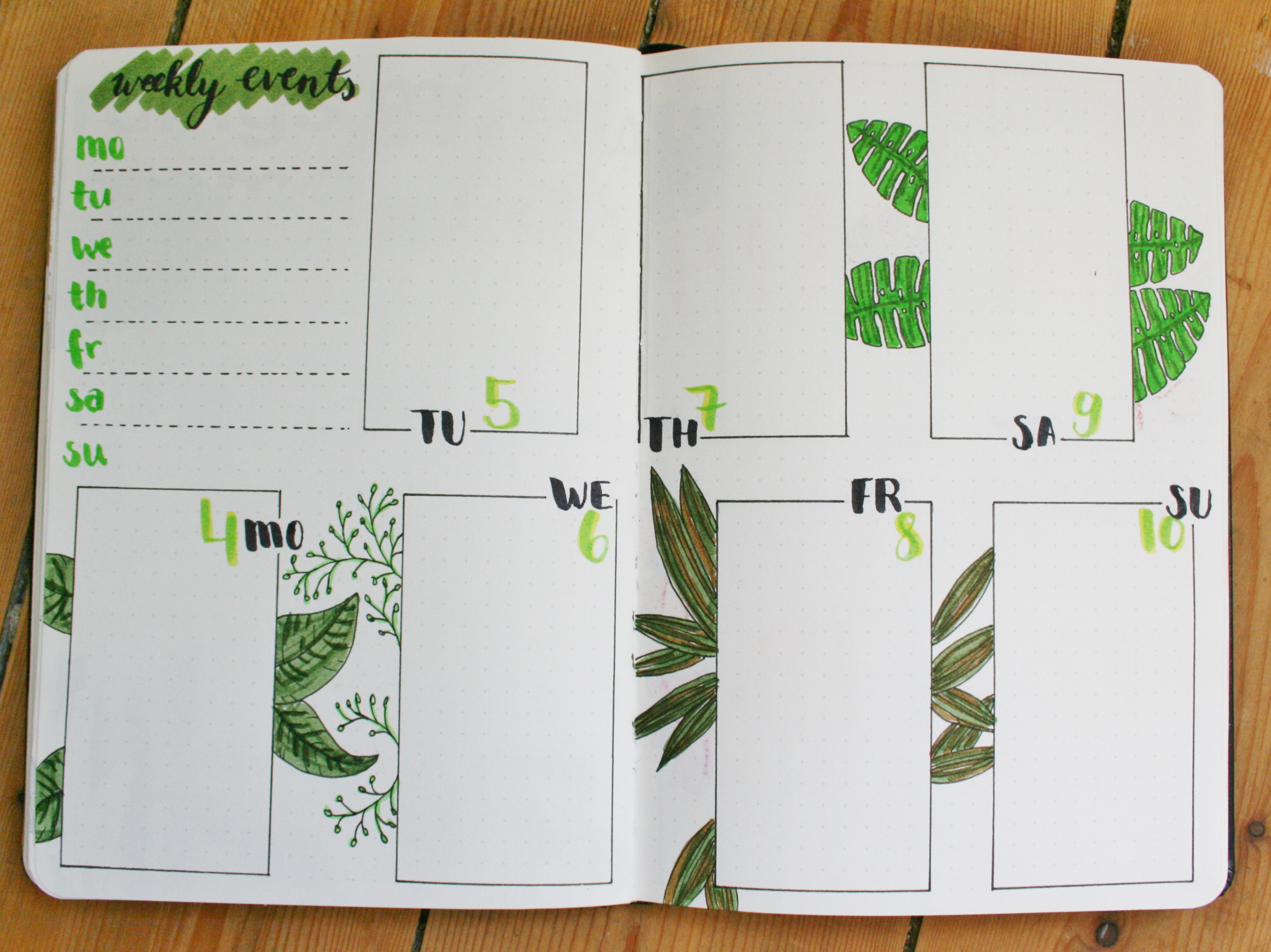
I’m still figuring out if this works for me but right now I’m just happy about the small change since it leaves room for illustrations 🙂
My second weekly spread also features a plant theme (who am I even kidding anymore, my spreads feature nothing other than plants and flowers 😀 ) but this time it’s all about pink and purple tones:
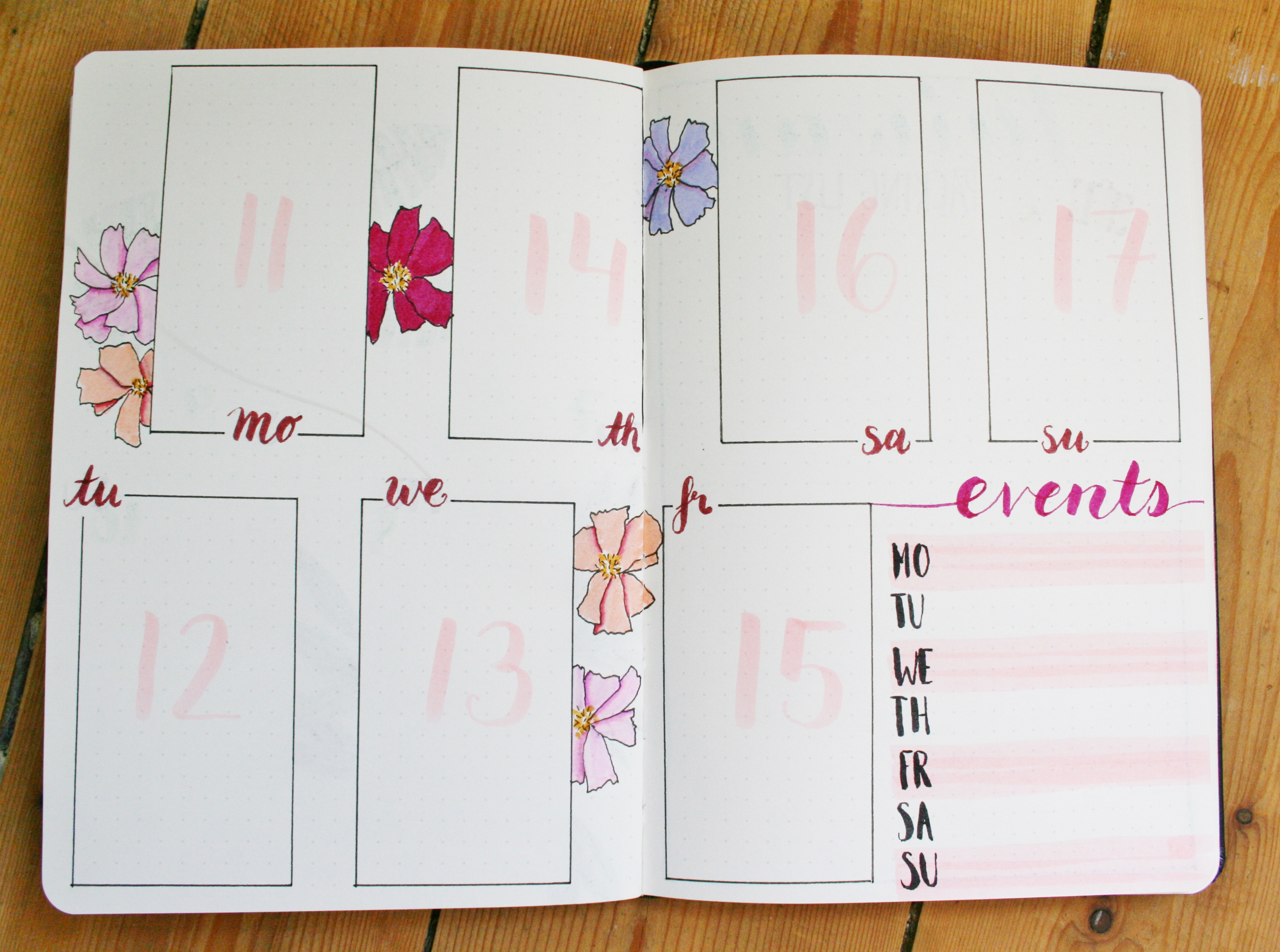
Don’t ask me why I put the days down in this weird order, I didn’t really think about it, haha!
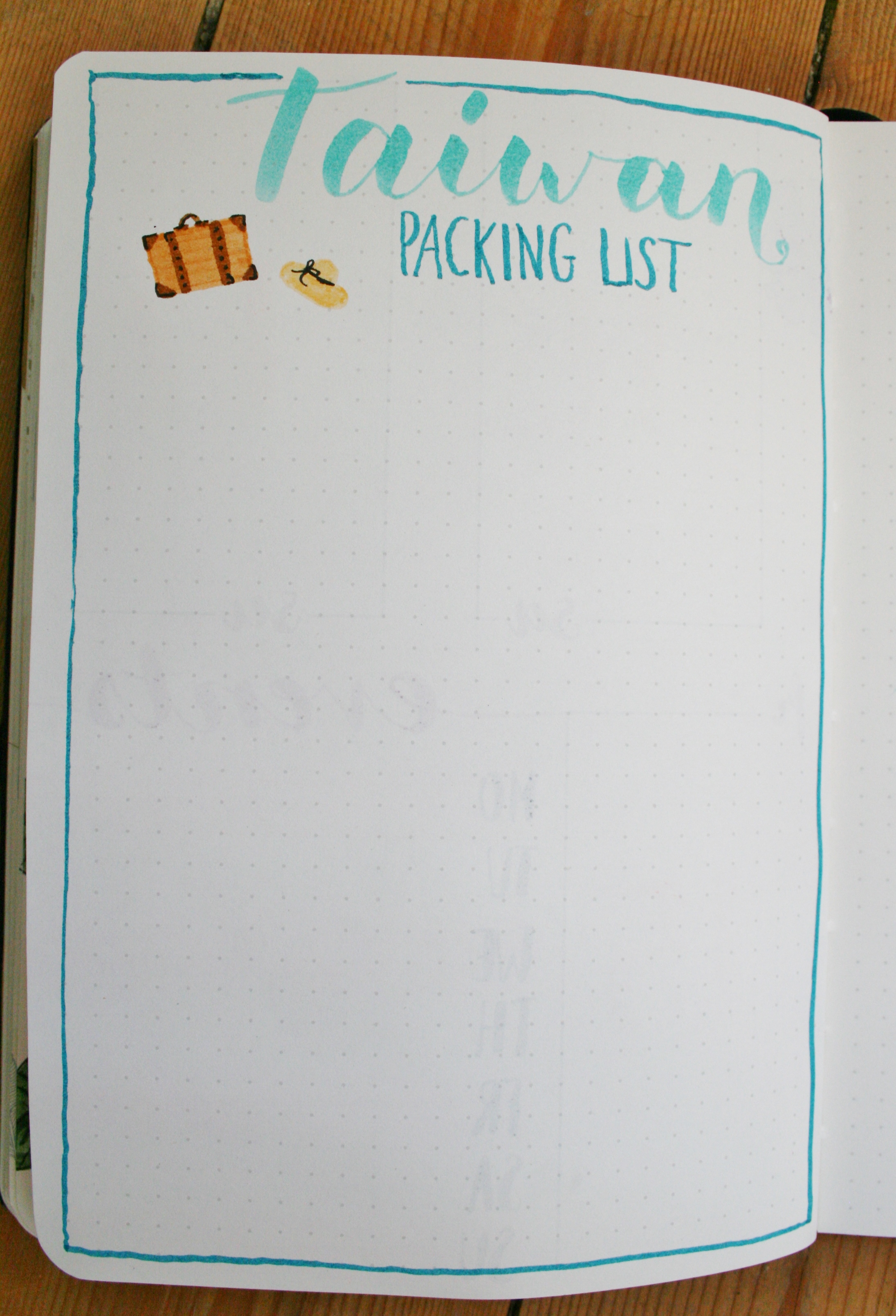
Instead of creating more weekly spreads this time, I decided to include space for a simple Taiwan packing list. Aren’t these turquoise colors gorgeous?! (Insert heart eye emoji here). You can see a good example of the ghosting I was talking about earlier on this page. The weekdays from the page before are pretty visible here. It’s still ok though, I can live with it 😀
And this is already it for this month! Please share a link to your designs with me in the comments, I would love to see some of them!
<3
Lena.
Those spreads are all so amazing! I’m definitely going to look into getting those pens!
Thank you, Brandon! 🙂